Timeline
June 2025 - Current
My Role
Co-Founder
Product Designer
Team
1 Designer
1 Developer
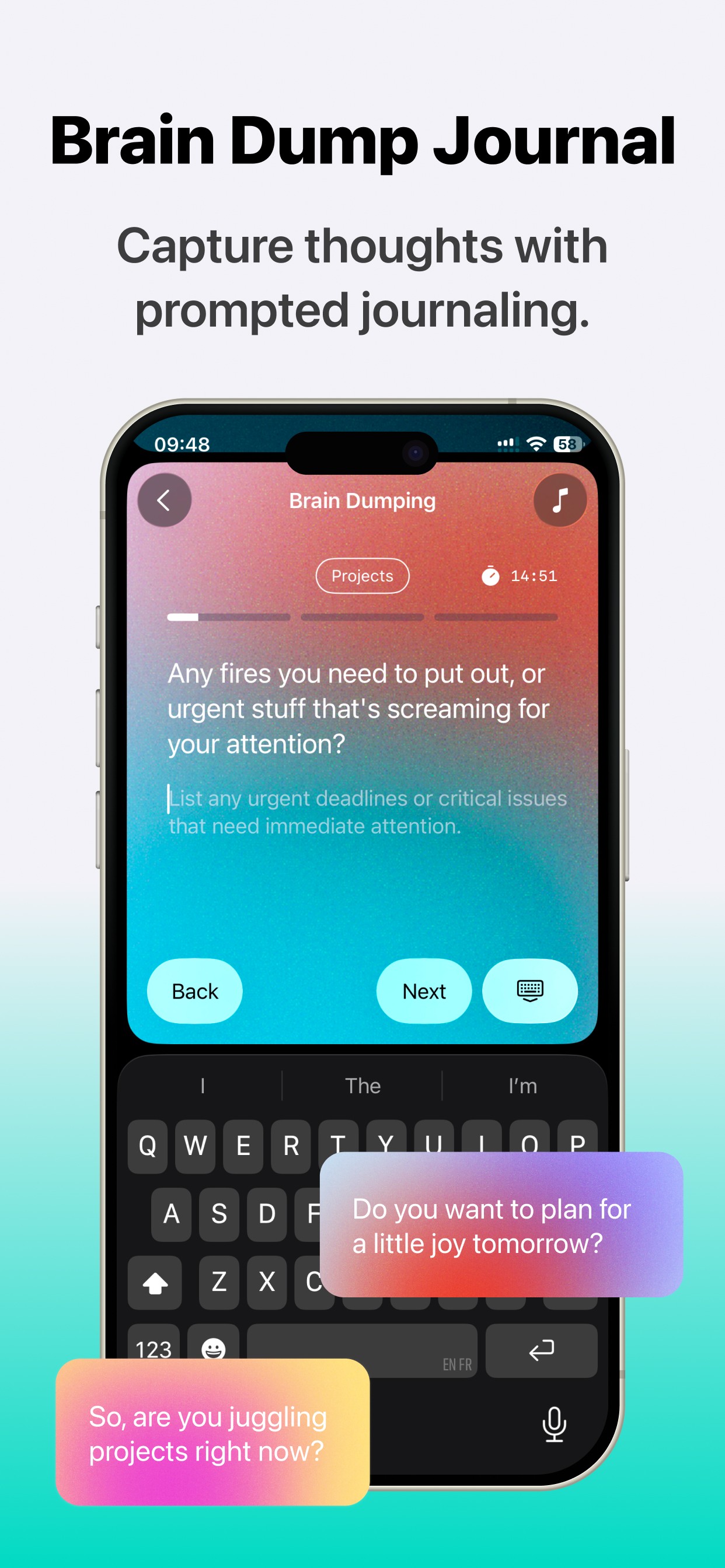
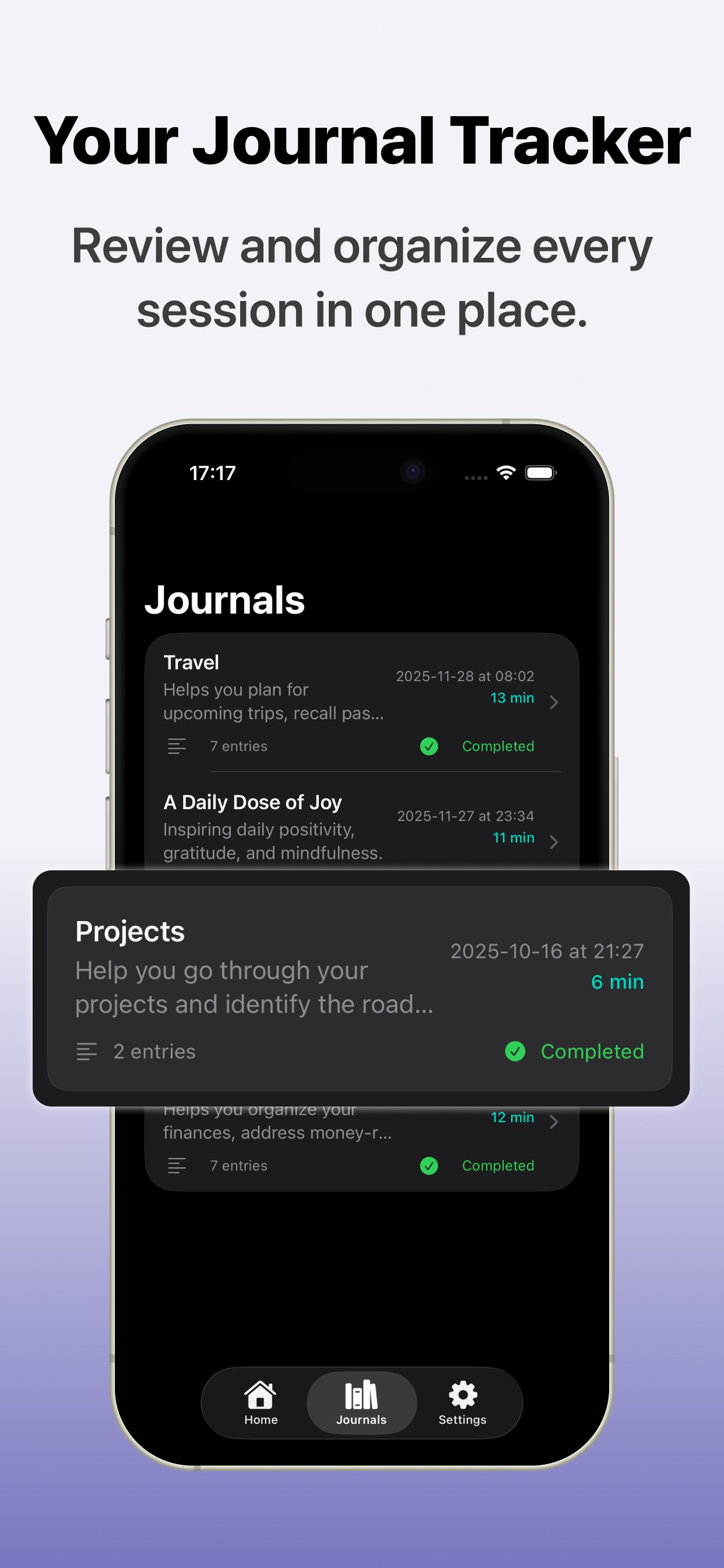
Prompted Journal
Productivity
B2C
Cognitive Loads
Liquid Glass
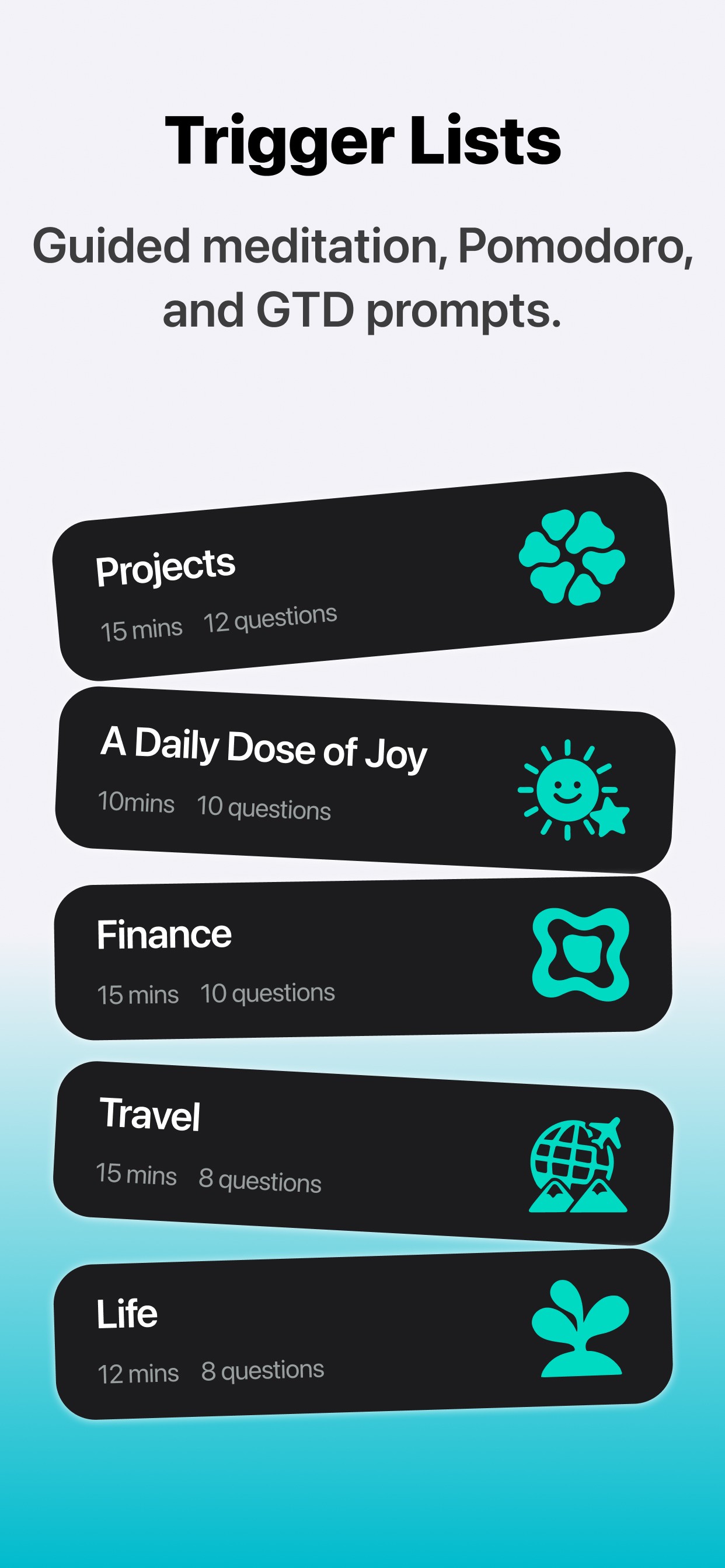
Trigger List
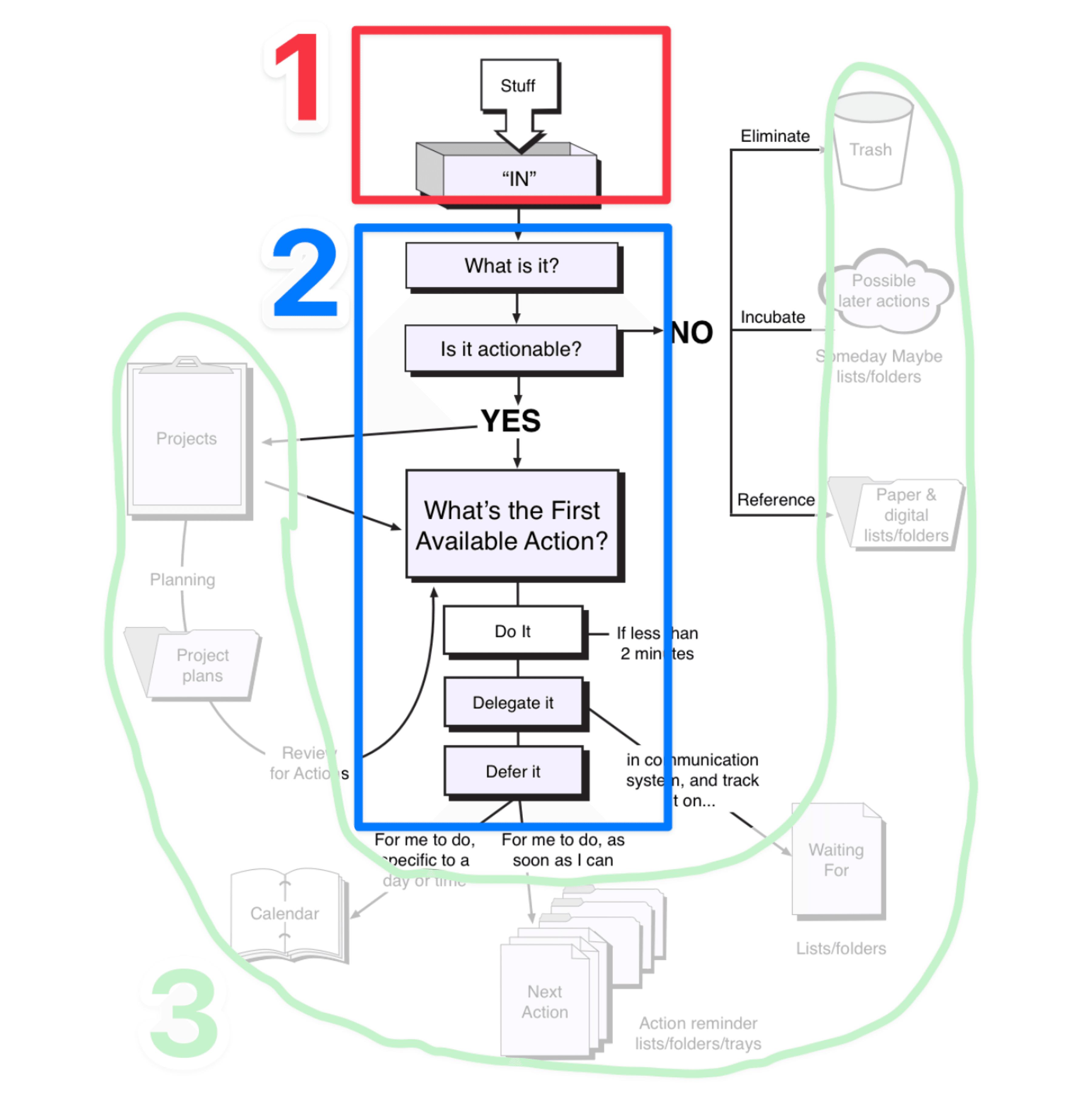
Getting Things Done

An untraditional start: landscape analysis first
Instead of beginning with user needs, we tried something neither of us had done before. We started with landscape analysis.
We looked at the App Store, competitors, and social media, imagining where our app could eventually sit.
This idea came from studying Nest, a product that positioned itself clearly from day one. We were curious about this approach, and it offered a major benefit: instead of searching for a niche need, we could design with the market in mind from the start.

Survey to test the market
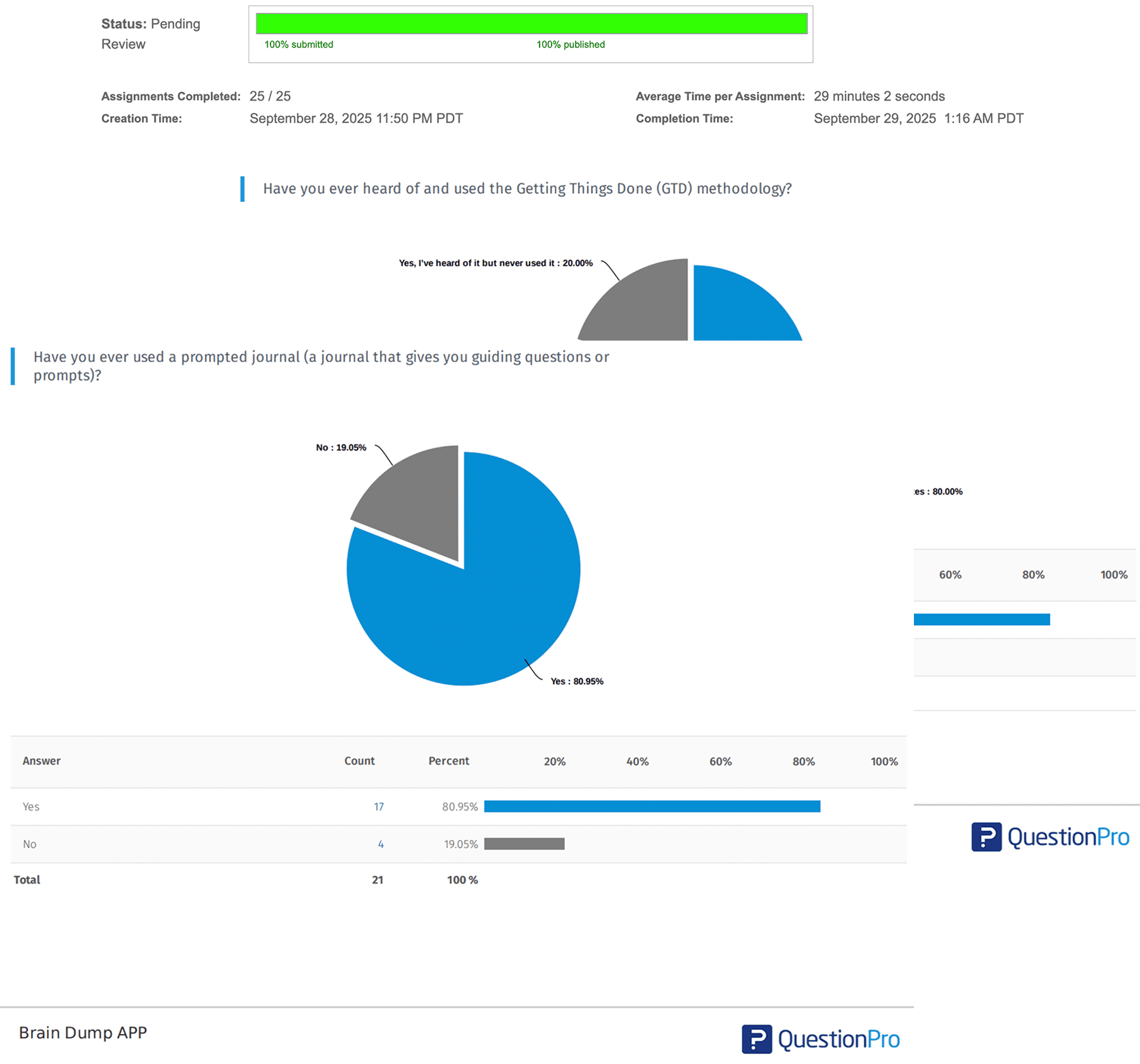
We noticed that journaling was both popular and aligned with GTD. So I decided to run a survey to test the idea.
I created a questionnaire and shared it through Amazon Mechanical Turk (MTurk). We sent out 25 surveys and collected 22 valid responses. Participants came from across the U.S., mostly aged 20–35, with many working in tech.
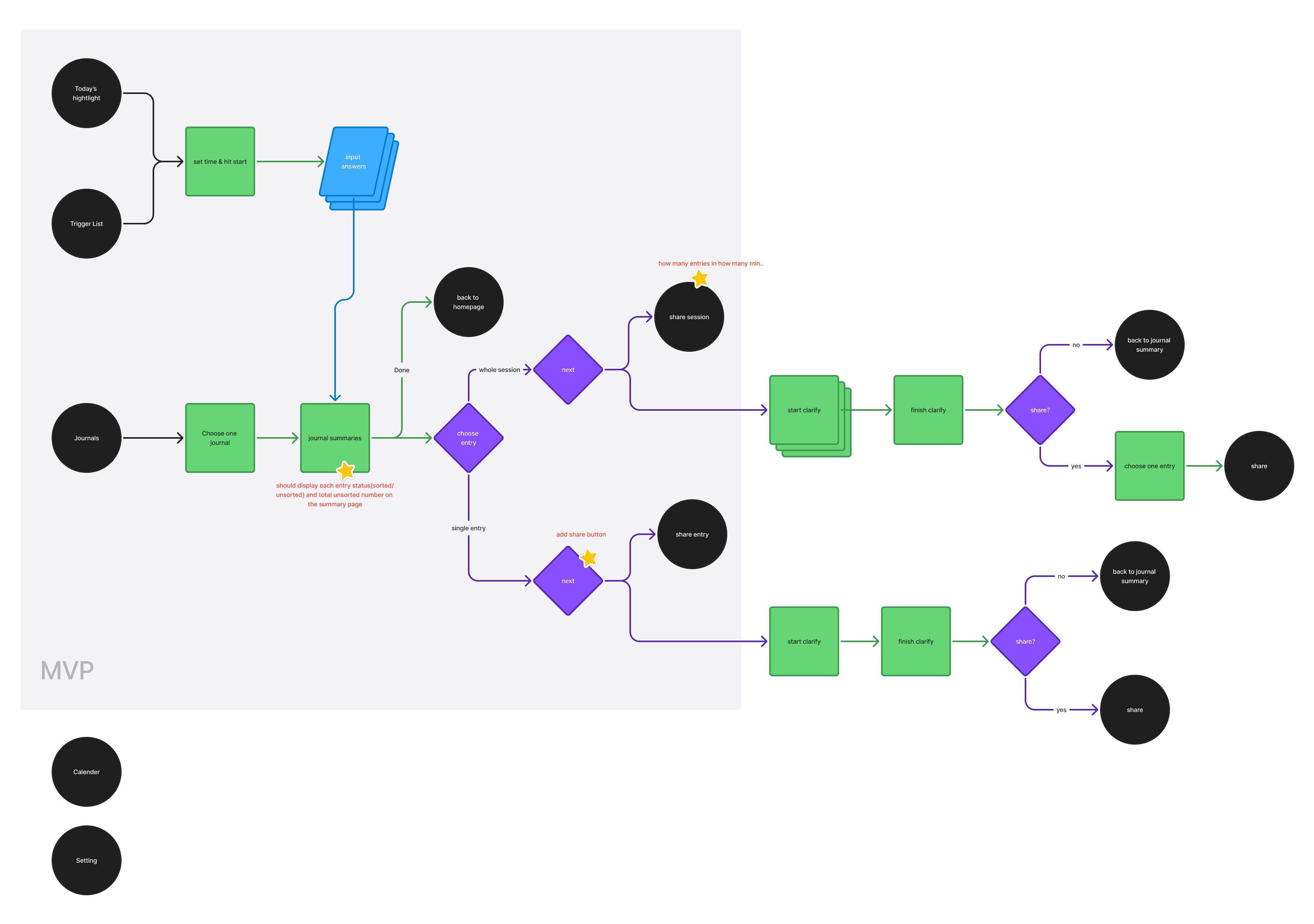
First design and user flow
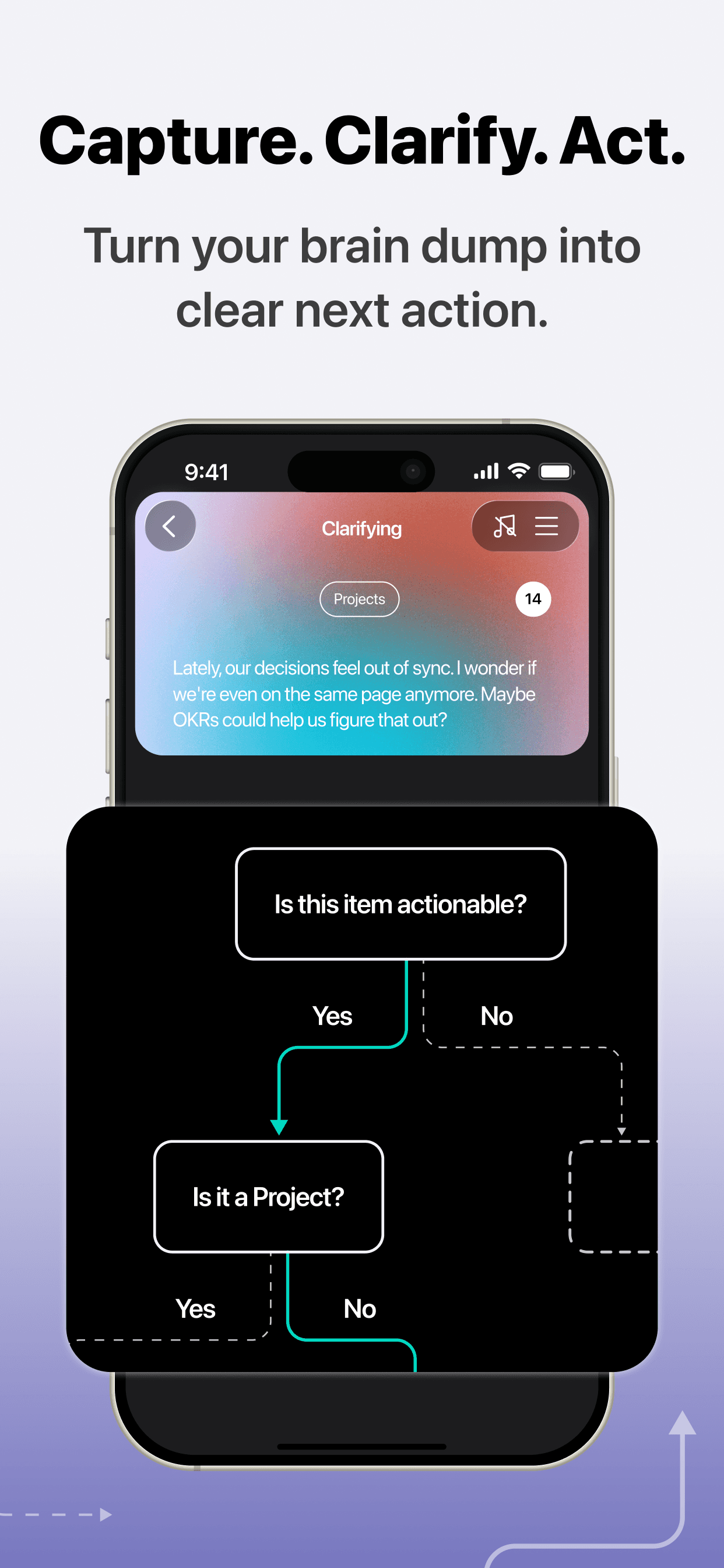
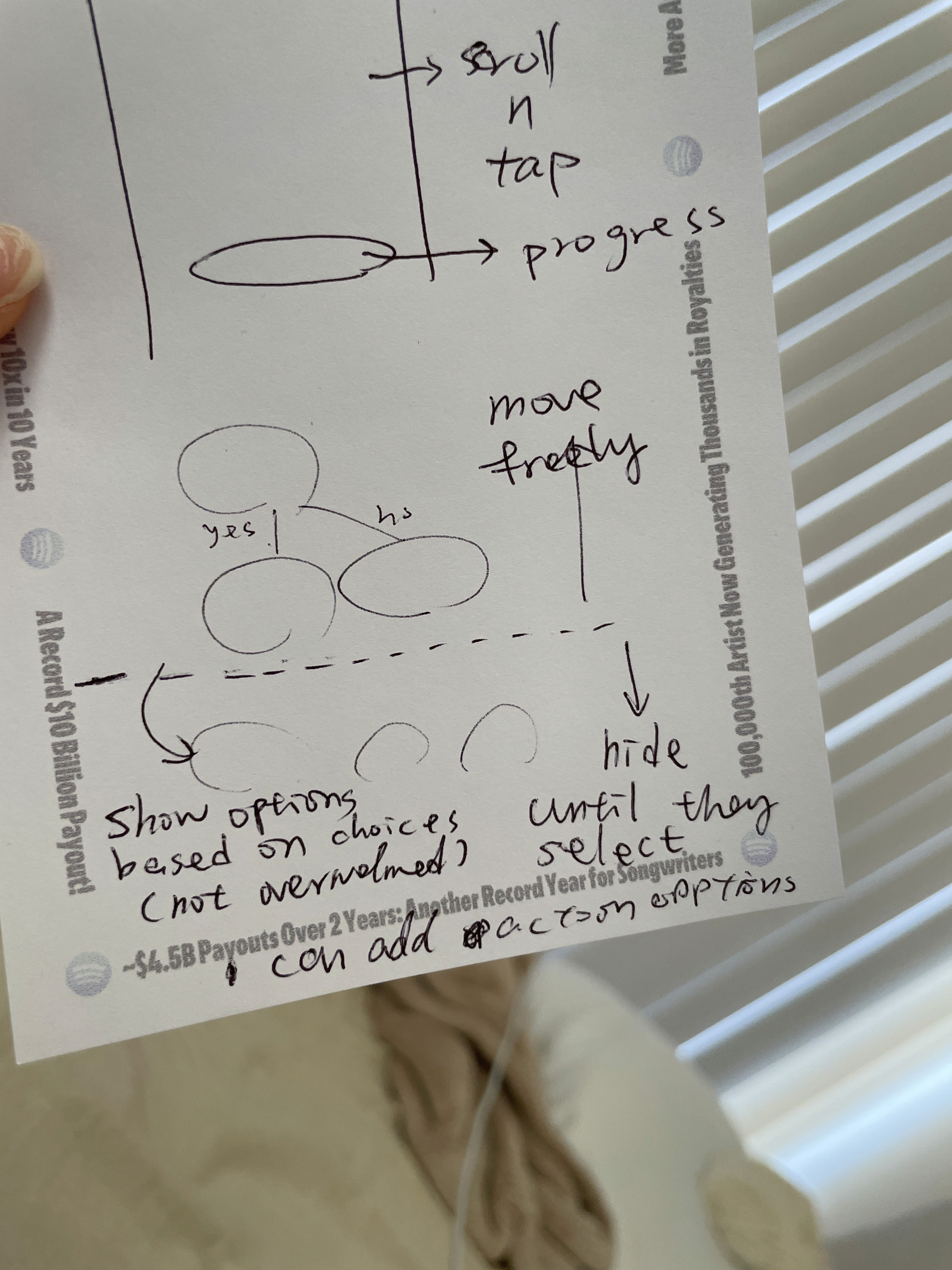
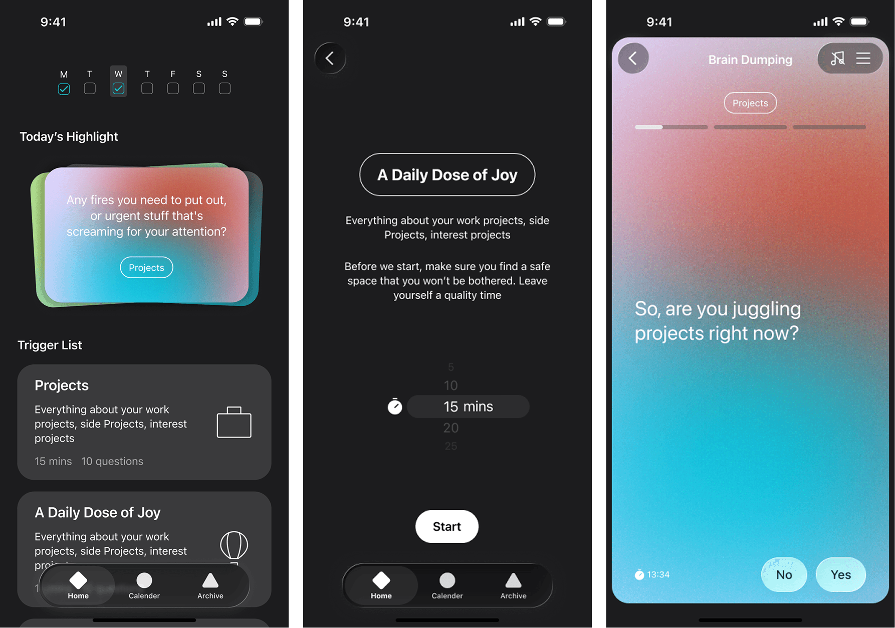
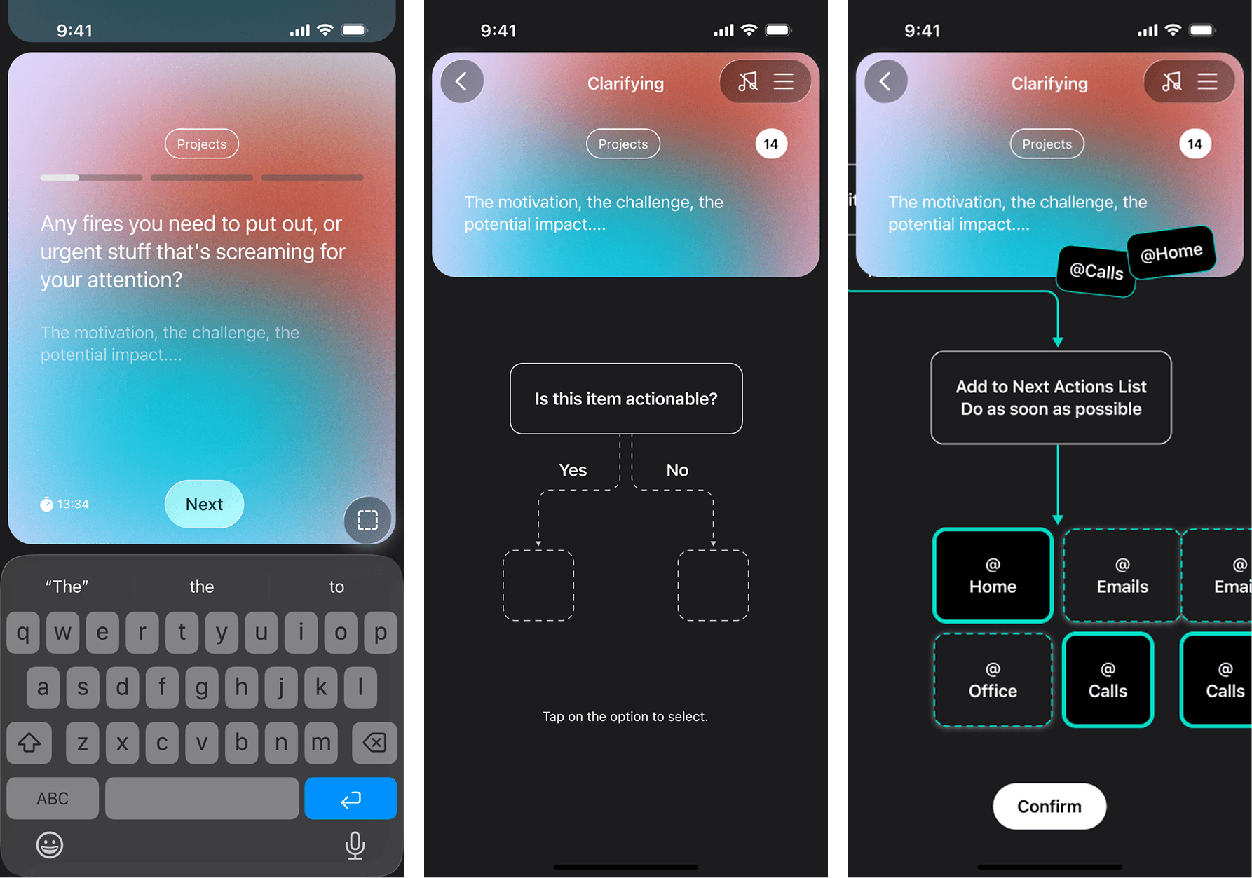
At the same time, the first design draft was ready. It included the main functions: Home, Brain Dump, Clarify, and Trigger Lists.
Users would start by picking a trigger list that interested them. The session would begin with a series of prompts to brain dump their thoughts, then move straight into Clarify to identify the next action.
Testing the first design: Cognitive Walkthrough
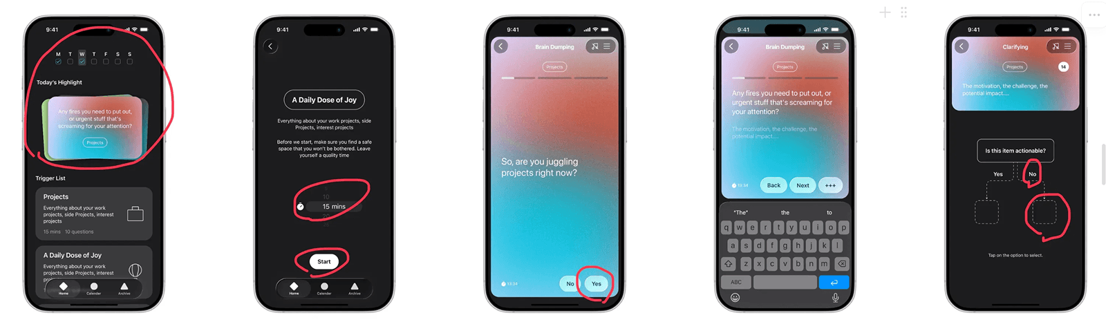
To test the early design quickly (before we had a prototype) I conducted a cognitive walkthrough.
This method only requires static screens. I asked participants what they thought each page was for, what they wanted and expected to do next, and where they would click.
It was a perfect early test. Low cost, fast, and very good at exposing flow issues and usability gaps.
🧩 Survey Insights
S1
GTD is niche for the general public, but strong within certain communities.
🧩 Cognitive Walkthrough Insights
C1
A quick success is important for first-time users.
C2
Users may not always want to dedicate in one session.
A milestone moment: from research insights to actions
The survey and walkthrough revealed several insights that pointed to clear problems we had to solve. I created a UX report for my teammate and we held a full review session.
The biggest UX recommendation was to separate Brain Dump and Clarify.
S3 & C1 ->
New feature: A place for direct and fast note input.
S3 ->
Increase “Archive” feature to higher priority.
C1 & C2 ->
Separate Brain dump and Clarify.
S4 ->
Increase reliability by… providing Exporting option.
Second design iteration: show the moment of truth sooner, and redefine MVP scope
Users needed to feel the value quickly and understand how the app works. Forcing both steps to happen together only made the experience feel long and confusing.
We agreed to make major changes to the flow and reset our MVP scope. I redesigned the flow to surface the core value earlier.
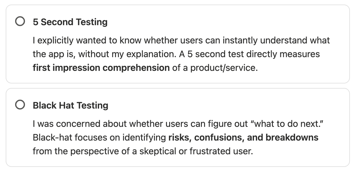
Small tests to validate the homepage
Along with the new flow, I ran two small tests to confirm that the homepage communicated the product clearly.
I wanted to know whether users could understand what the app does without me explaining it first. The homepage carries a lot of weight, and it should speak for the product on its own.
The two tests were:
5-second test
Black hat session
Improving ASO & Marketing
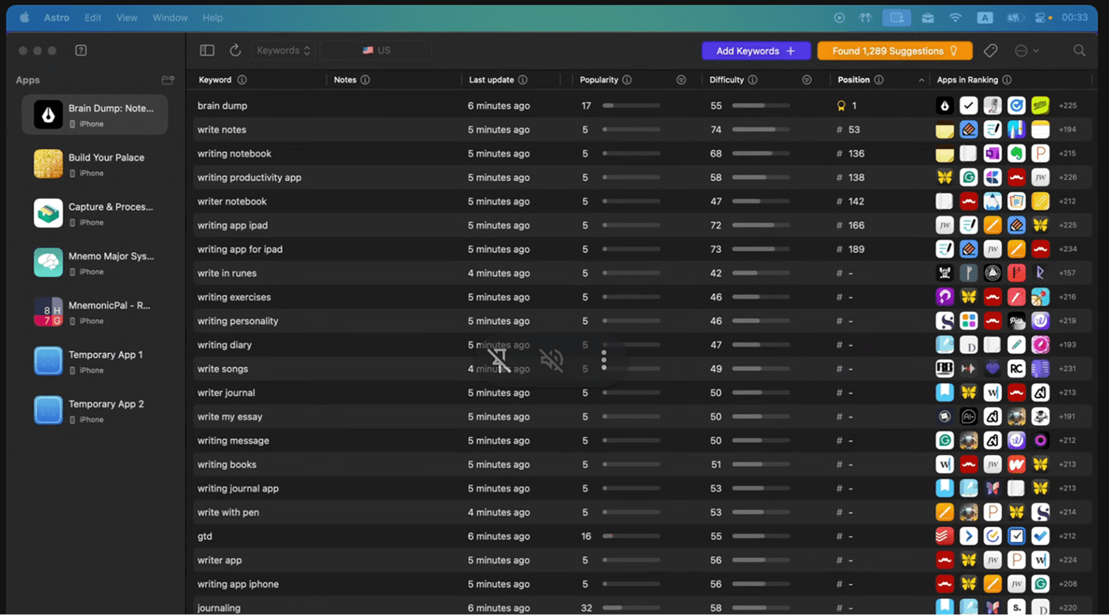
After reviewing our backend data, we realized we needed to strengthen our App Store presence. That meant improving ASO: name, subtitle, keywords, reviews, conversion rate, screenshots, outside links, and more.
We are using Astro to analyze competitor keywords and plan a more accurate and wider keyword strategy.
There is still a lot to do. Stay tuned and we’re continuing the journey!