Link: https://linkss.ai
Timeline
Feb 2025
(2 weeks)
My Role
UX/UI designer
Team
1 Designer
1 Product Manager
1 Full Stake Enginner
Design System
Startup
B2B
Website
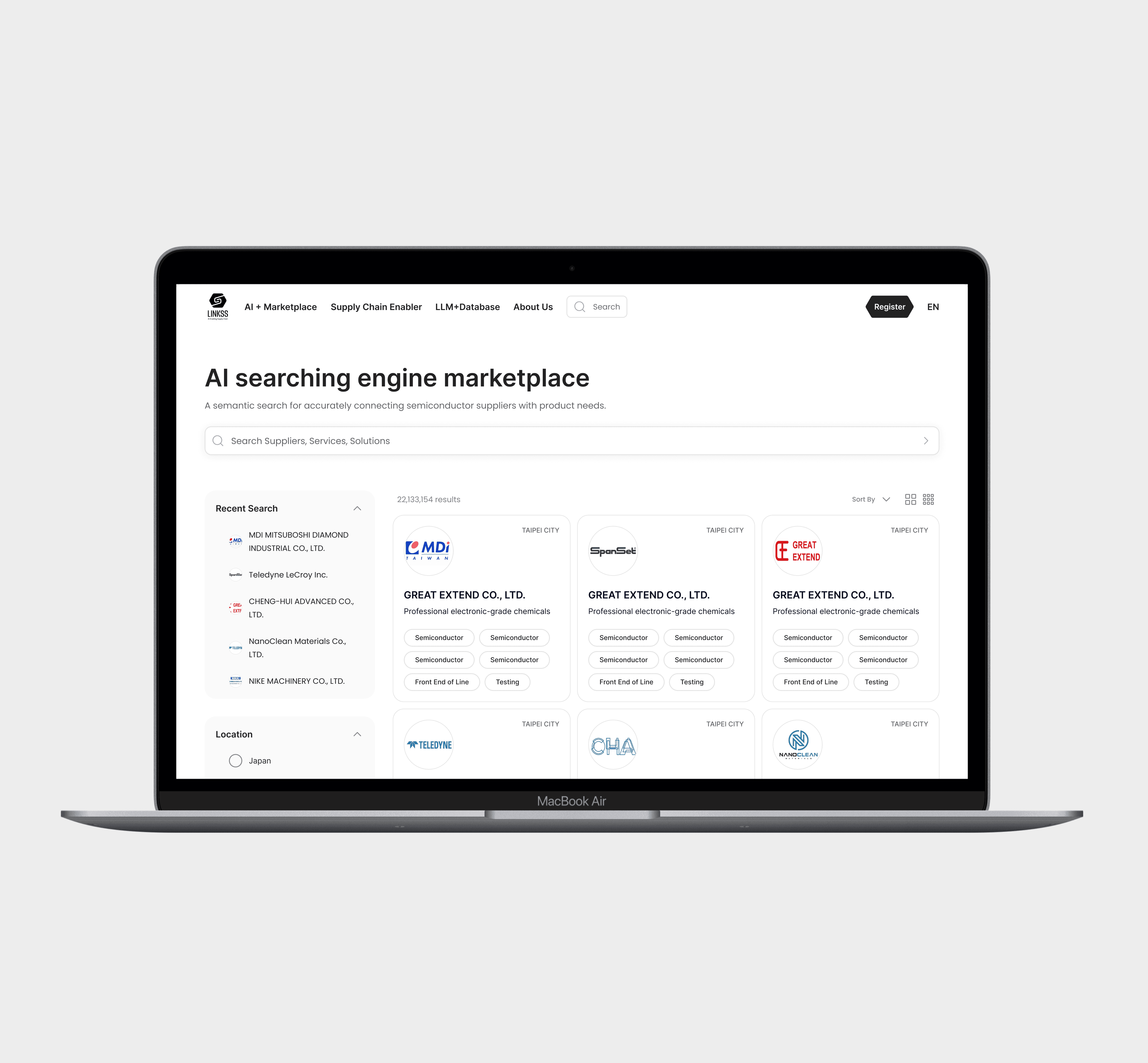
This was a freelance project for an early-stage B2B startup.
As the sole UI/UX designer, I was responsible for designing the company’s first public-facing website and building a scalable design system to ensure visual consistency, development efficiency, and long-term maintainability.

🎯
Objectives
1. Speaking for the company
Design a clear, professional website that communicates the product’s value.
2. Build a scalable design system
Build a design system that allows the product to scale easily in future iterations
3. Finish project in 2 weeks
Align closely with the PM and engineers to ensure development feasibility
✨ Process
Collect Style References
I gathered visual references from similar industries and potential partner brands to define a style direction that aligns with both our product values and the expectations of our B2B audience. These references helped establish a visual tone that felt both credible and connected to the ecosystem we were entering.
☟This is my own design reference datasbase!


Observe the Pilot Tool & Identify Atoms
I audited the entire website, documenting every instance of recurring UI patterns and broke them down into their visual "atoms": colors, typography, spacing, and icons. This helped me identify common building blocks and prepared the foundation for scalable component design.
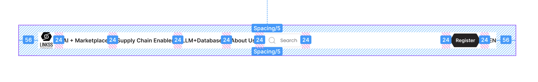
Structure Information Hierarchy
I analyzed and organized the information presented on the website by defining clear content hierarchies—distinguishing between primary headings, subheadings, body text, and labels. This helped users easily scan, understand, and locate the information they needed.


Design the Components
Based on the design tokens (colors, typography, spacing), I built modular components such as buttons, radio buttons, checkboxes, dropdowns, and cards. Each was structured to be flexible, reusable, and easy to maintain—ready to scale with the product.
Apply Autolayout
I applied Figma's Auto Layout to every component to ensure they adapt to different content lengths and layouts. This not only made the design more flexible, but also helped speed up future edits and layout changes with minimal effort.

Variants & Variables
I used Figma Variants to organize different states of each component (e.g. default, hover, active, disabled), and Variables to manage tokenized styles like colors and spacing. This approach made the system more scalable and efficient—enabling both developers and future designers to work faster with fewer errors.
Check Web Content Accessibility Guidelines (WCAG)
I followed key WCAG guidelines to make sure the system supports accessible and inclusive experiences. This included ensuring tappable areas were large enough, using sufficient color contrast, and applying larger text styles where needed for readability.
Focus Area:
Sufficient tappable areas
Minimum text size for readability
Accessible color contrast ratios


🤛🏻
Reduced the number of design revisions thanks to upfront alignment and systemized components
Clear brand direction based on early exploration and alignment workshops.
🤛🏻
The design system was adopted by the team for future pages
A foundational design system including tokens, components, and usage specs.
✸

