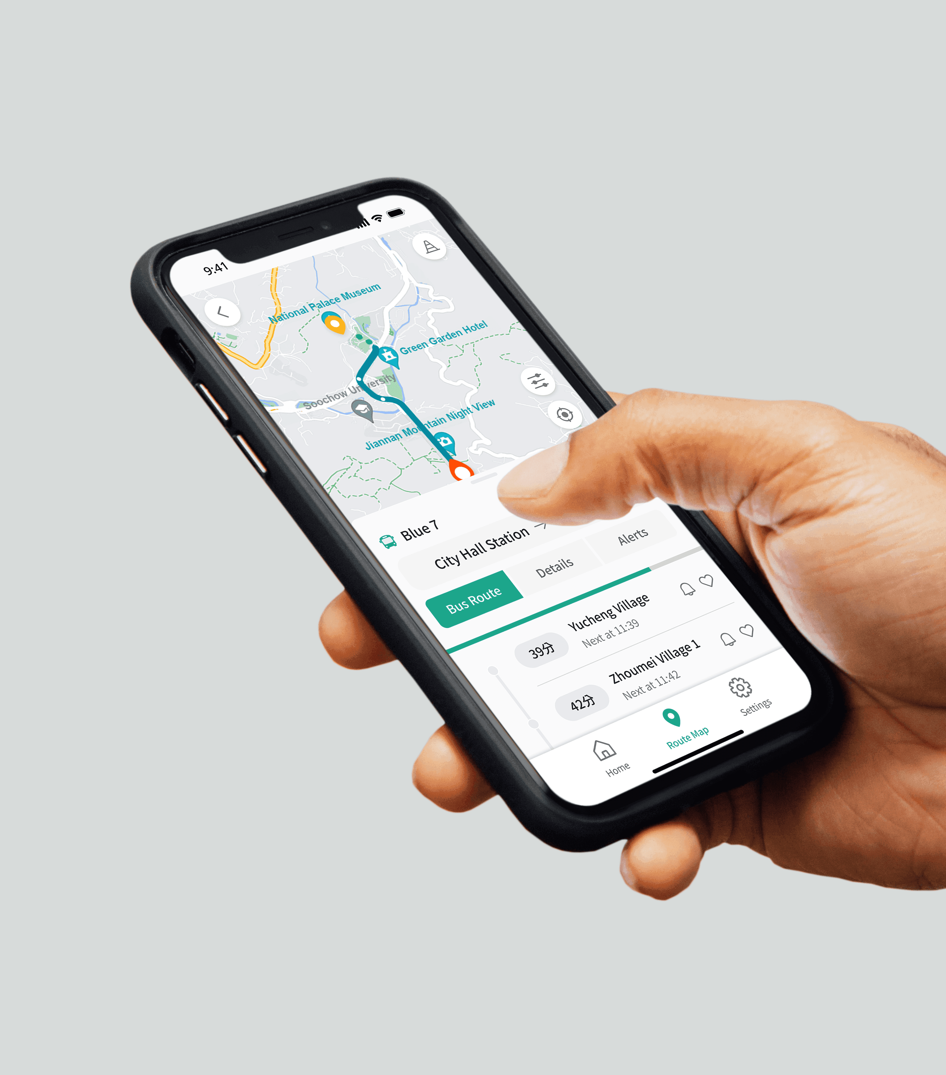
Oct 2023 - Dec 2023 (1.5 month)
Bus+
Redefining Growth for an 8-Year-Old Market Leader
Team
PM (me)
3 UIUX Designers (me)
2 Researchers (me)
Impact
2nd place
Among 20+ Groups
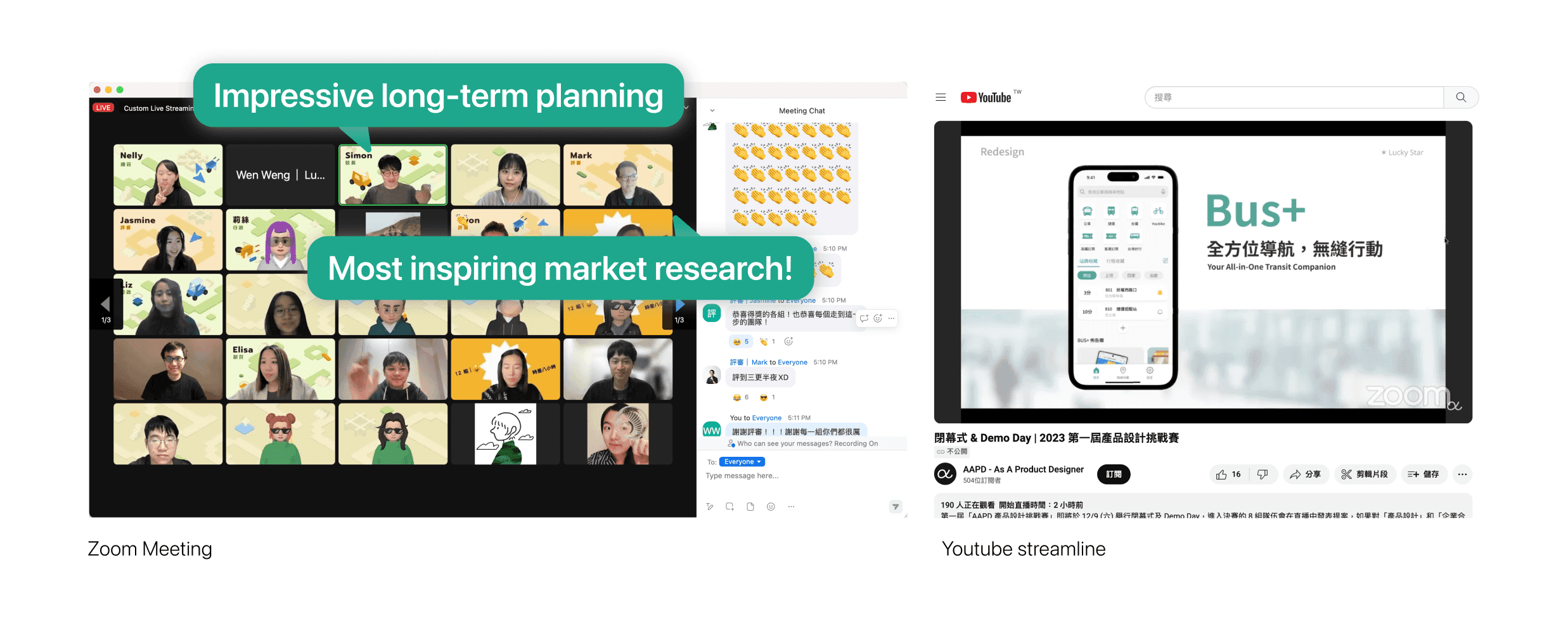
150+ audiences
Live-Stream Viewers
This is a product design competition in collaboration with a market-leading company, Bus+, where our mission was to tackle one of their most pressing challenges…Within our team, I wore multiple hats: I led the UX Research and UX design while also stepping into the role of Product Manager to guide the team, communicate with stakeholders, and define the product strategy.
The Brief
Problems, Objectives and Challenges
🤧 Problems for users
The APP has many great features and integration. But it takes for first-time user to learn to use it.
🤧 Problems for business
Bus+ is an integrated transportation app that has been a market leader for over 8 years. However, despite its long-term success, growth had slowed down significantly, signaling that the app had likely reached its current audience's saturation point.
🎯 Objectives
Our mission was to identify new user segments and redesign Bus+ to meet their needs.
🥊 Challenge 1: Identifying new users
The market for public transportation is vast, with users ranging from teenagers to seniors. However, how can we determine who the next potential user of Bus+ is?
🥊 Challenge 2: Balancing old and new users
We had to ensure that any changes would appeal to potential new users while maintaining a seamless experience for existing ones.
How We Started
Hear What The Existing Users and New Users Think
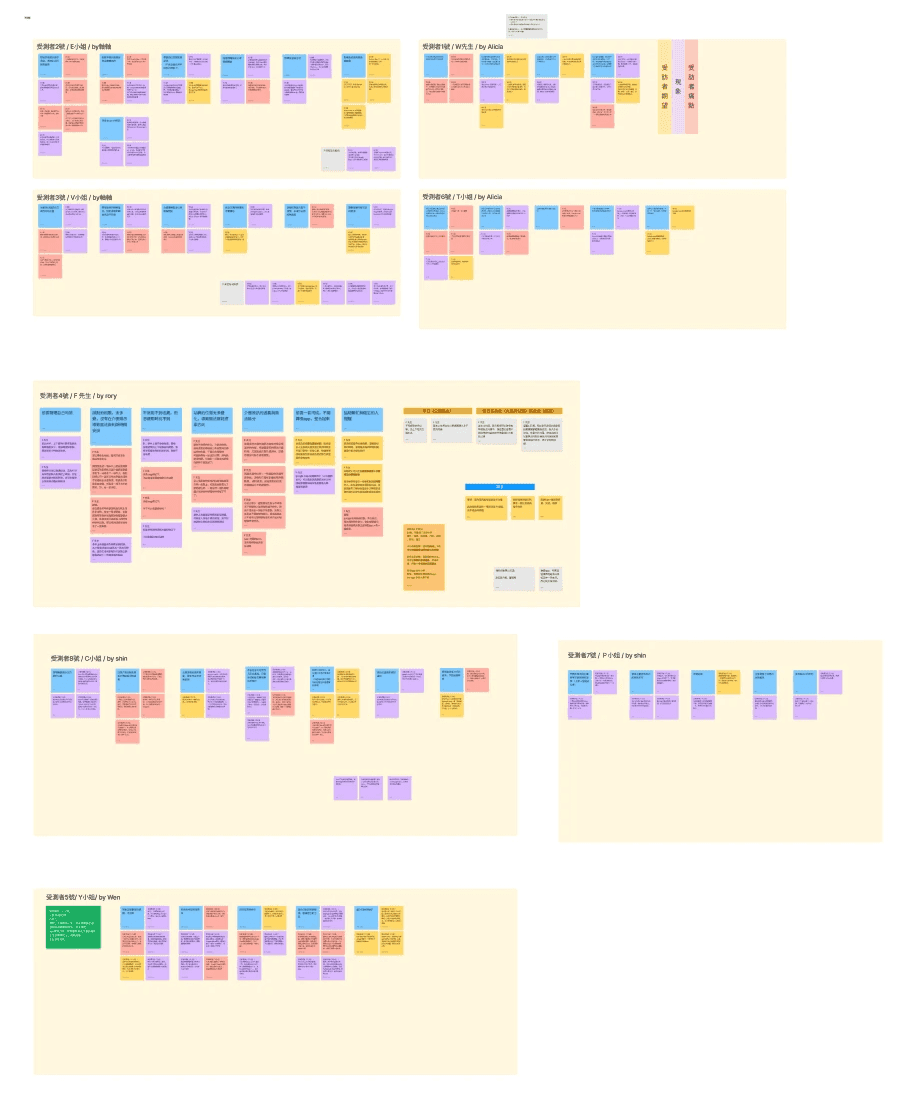
To uncover actionable insights, I designed and conducted interviews with both existing users and potential new users. These conversations allowed us to identify key pain points, expectations, and commuting behaviors, which we then translated into user scenarios.


Analyzing Feedback
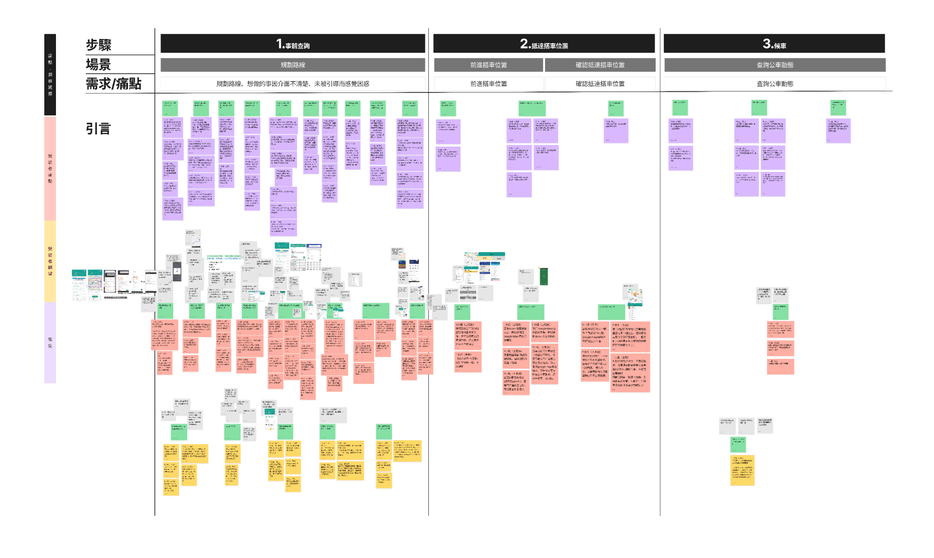
Affinity Diagram Journey Map To Thoroughly Analysis Feedbacks
People always have different motivation to visit the website and thus have various decision path. We concluded them into 3 different kinds of paths: Leaner, Answer Seeker, and Hesitator.
What We Uncovered · 1
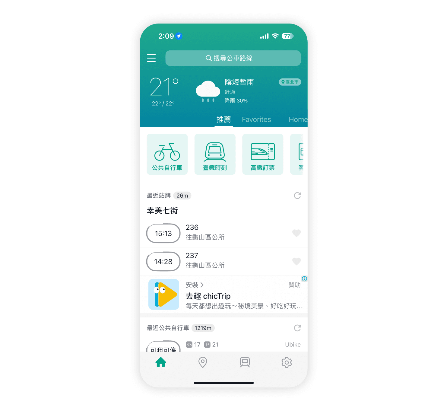
Outdated UI Decrease Young User Engagement
The app's visual and interaction design felt outdated, particularly for younger audiences, reducing their engagement.
Before
Solution
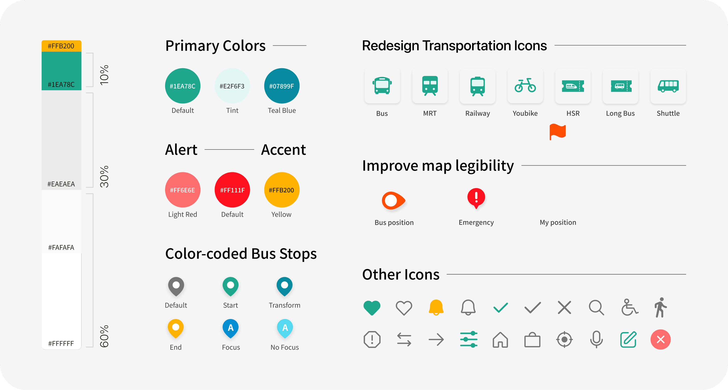
Rebuild the Design System
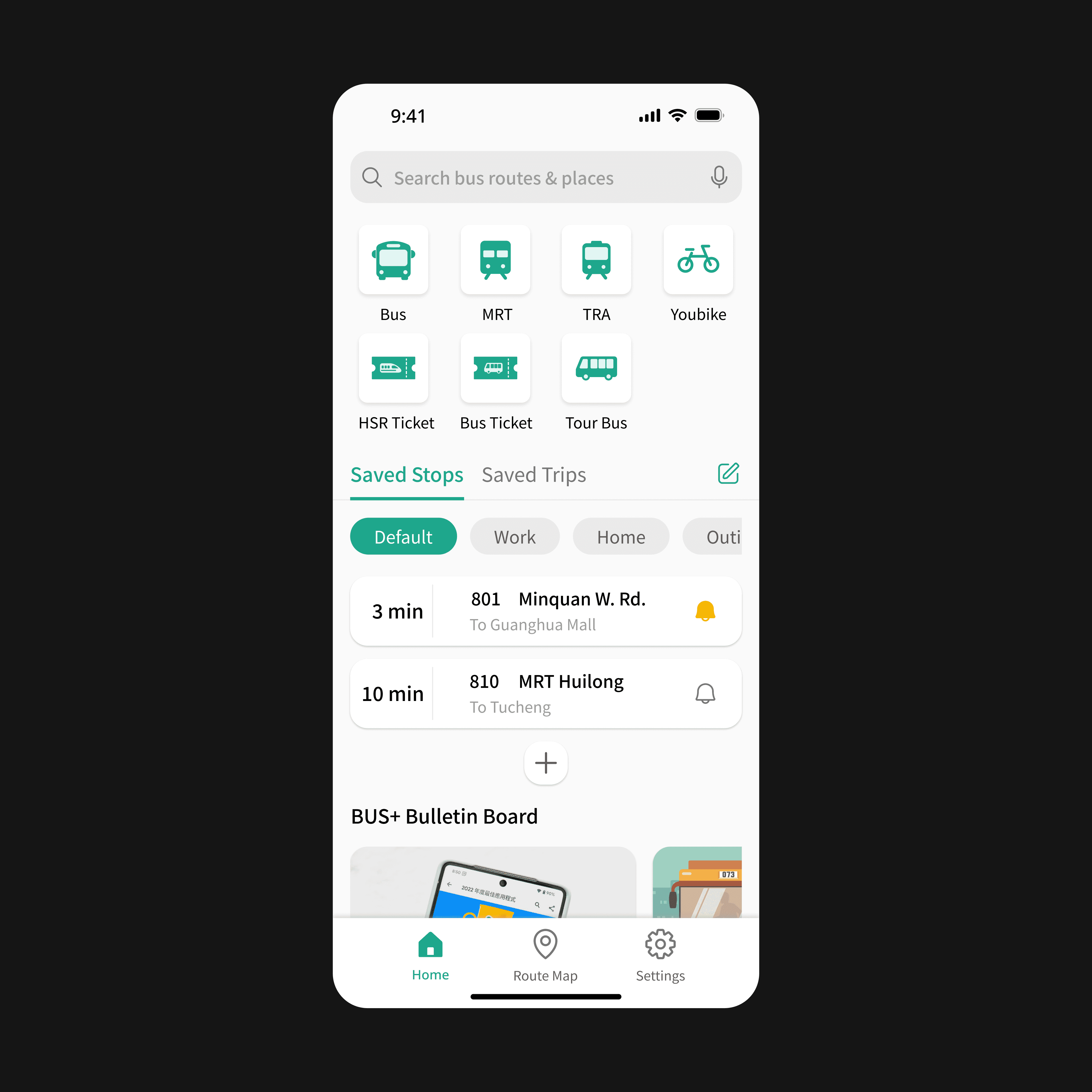
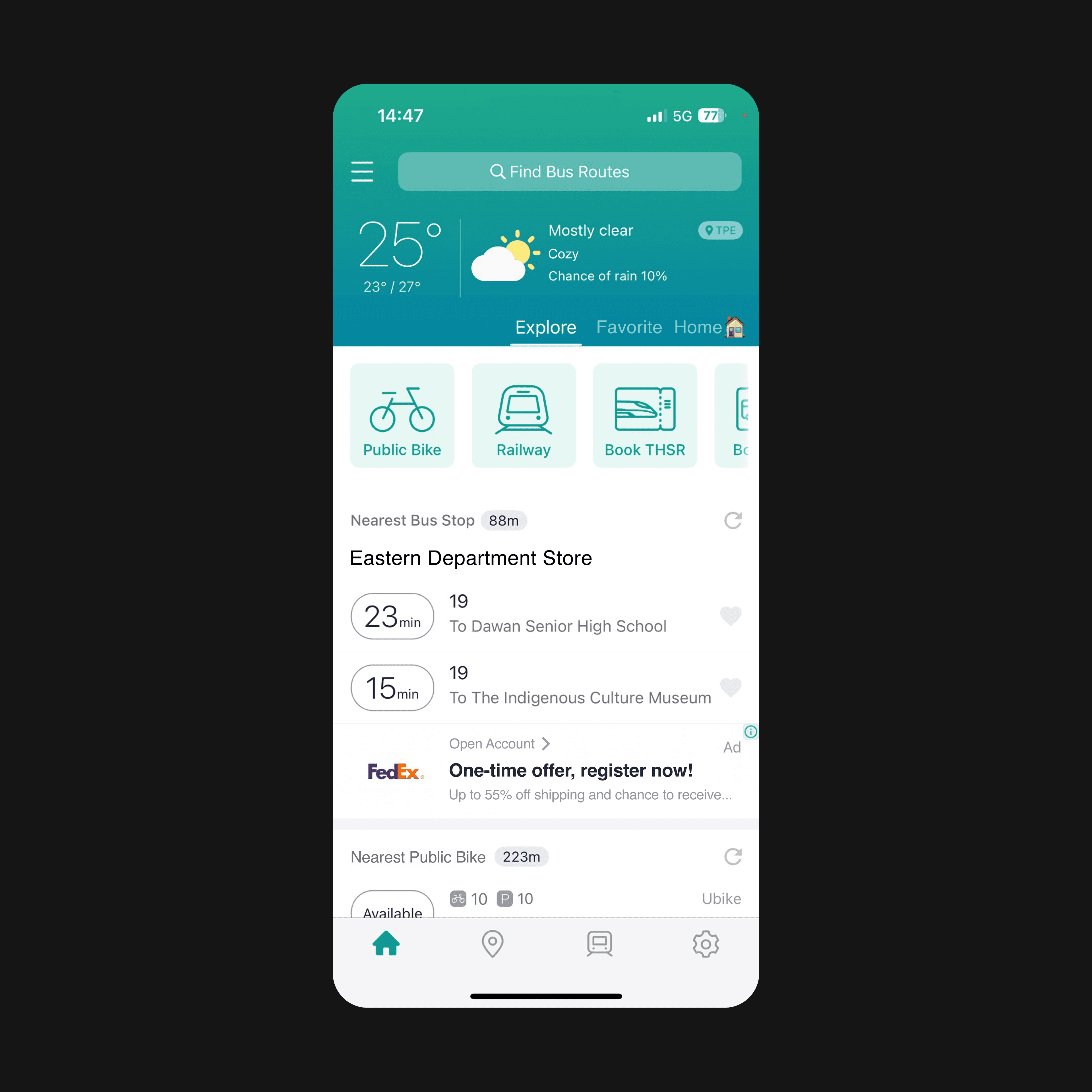
Based on the existing design style, we organized and delivered a new comprehensive design system. This could ensure consistency and also streamline future development.
The new design system.
Before and after: drag to compare.
What We Uncovered · 2
Key Features Are Difficult To Be Found
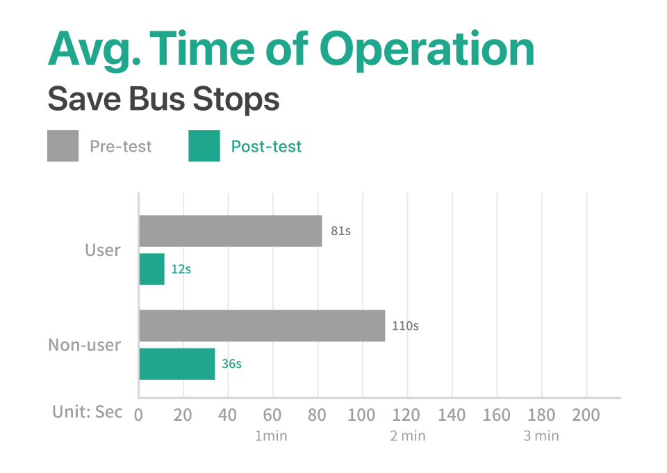
One of the app's main feature (and also a key DAU metric), "Saving Bus Stops," was overly complex and underutilized.
Before
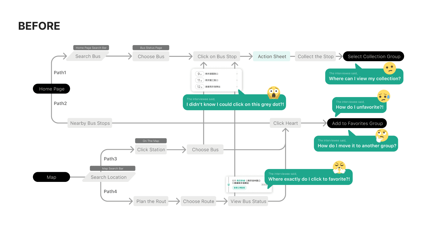
Solution: Simplifies Flow of Saving Stops. Elevate the save button and group levels for clear, unified management.
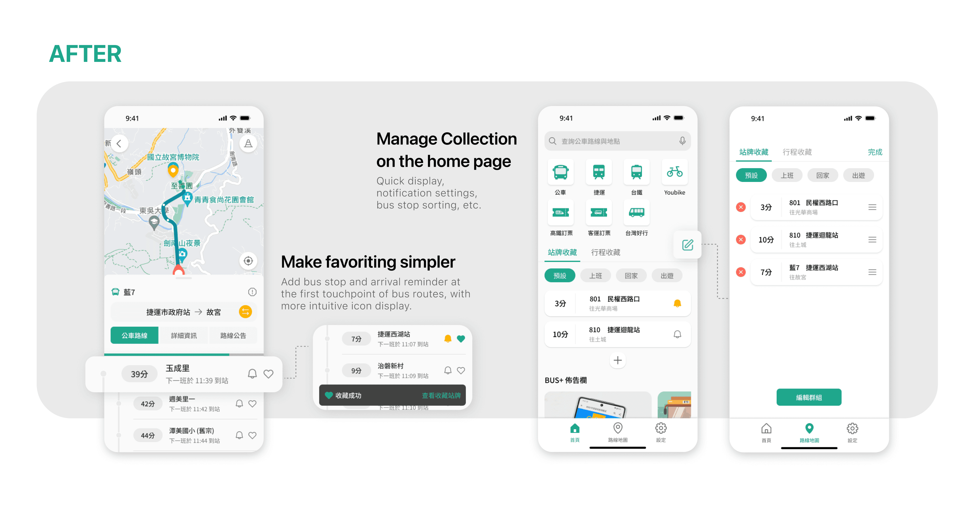
What We Uncovered · 3
Need for greater usability
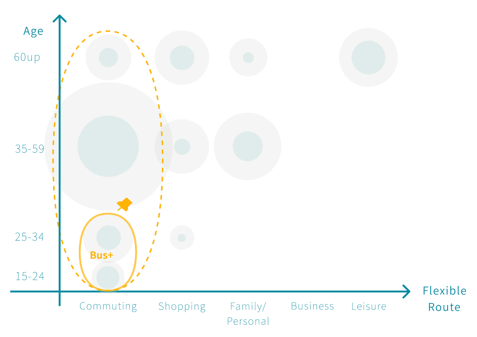
Through STP (Segmenting-Targeting-Positioning), we figured current and potential users. To accommodate them, we need to make sure of the high usability of our tool.
Basic functions like the homepage, search bar, and checking bus routes are difficult to use due to poor usability. Efficiency is one of the most important requirements for transportation apps.
Solutions
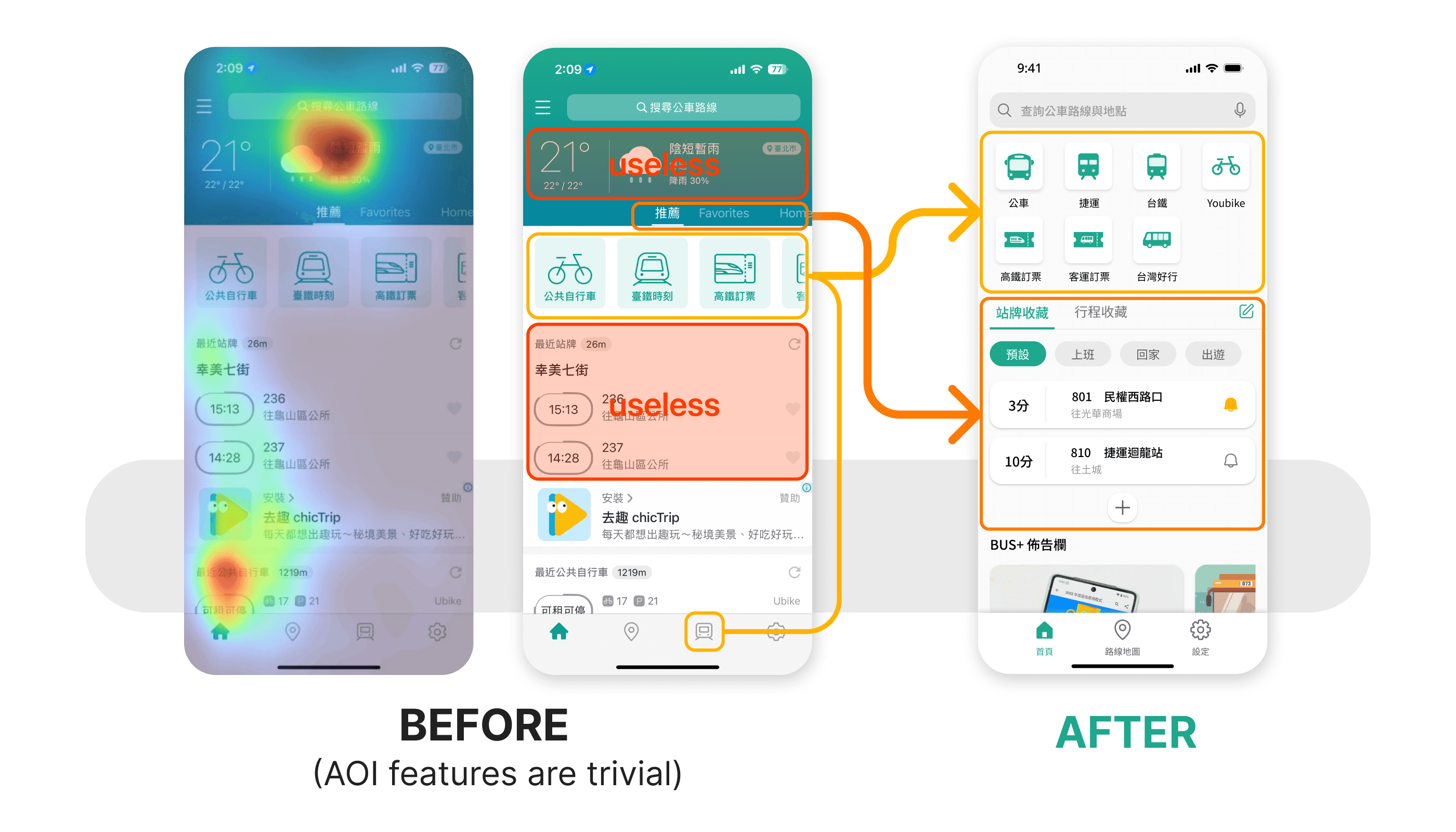
1. Update Homepage by Removing Unnecessary Features & Rearrange Hierarchy.
We found efficiency and timing are most vital things for our users. They don't need unessential info like the weather in the highlight section on the homepage.
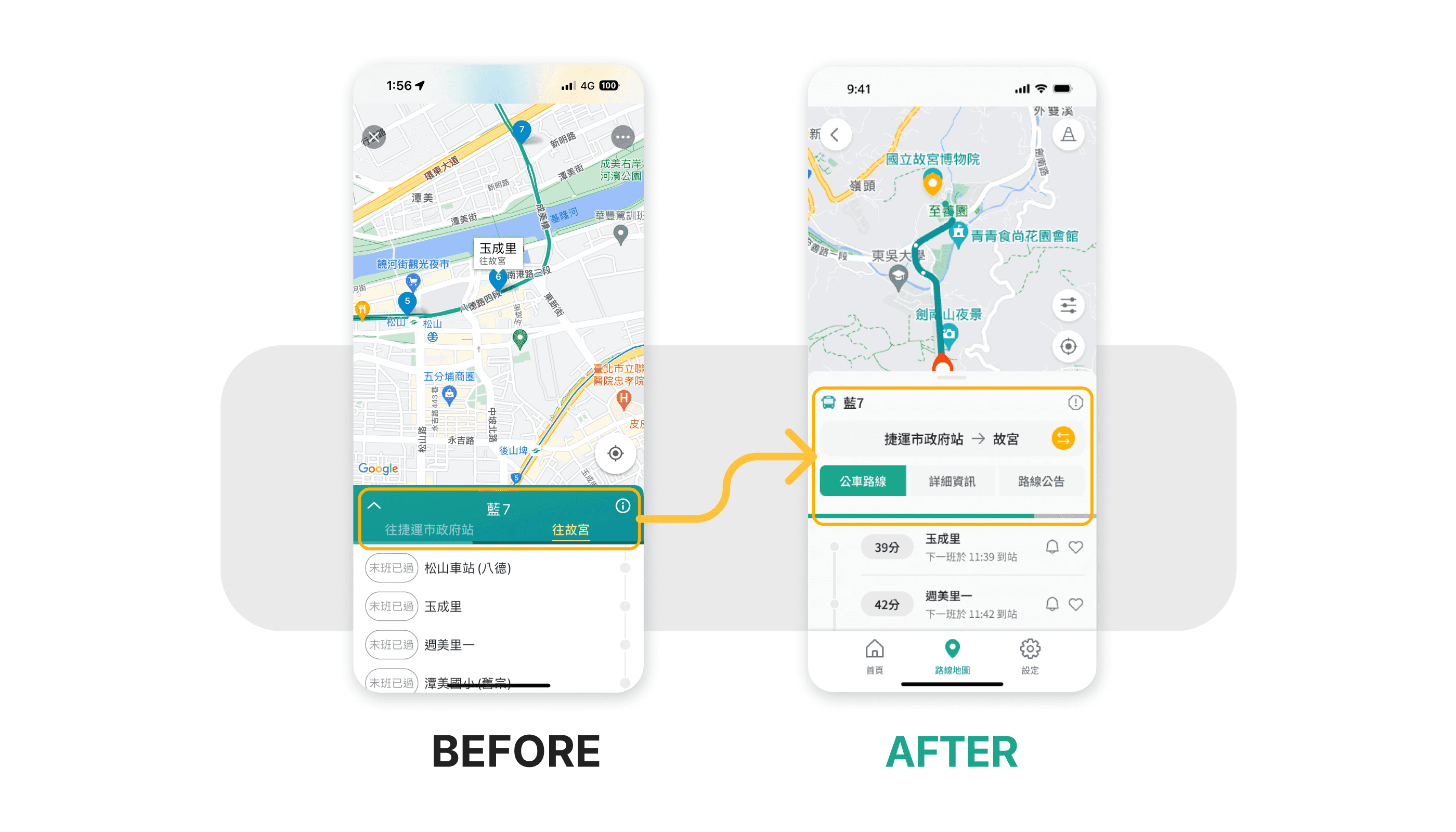
2. Update Bus Status Page
The previous version sometimes confused users the heading direction of the bus. Other real-time info were also hided in deeper layer, making it difficult to navigate.
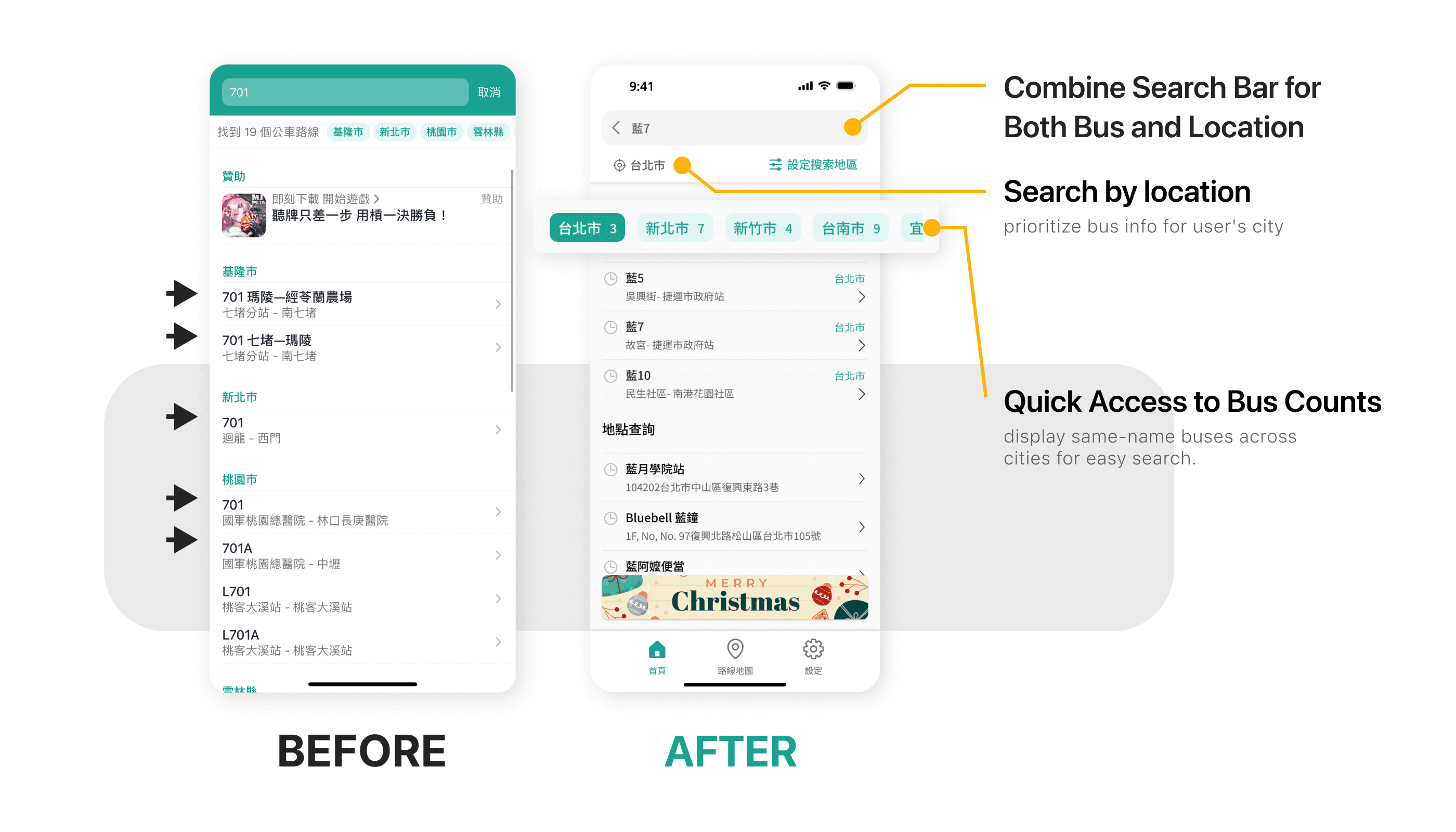
3. Update Search Bar And Result Display
Since this app support nationalwide buses, we suggestd making lables for each city on the top for quicker naviagte. And the search bar should integrated bus and locaton searches.
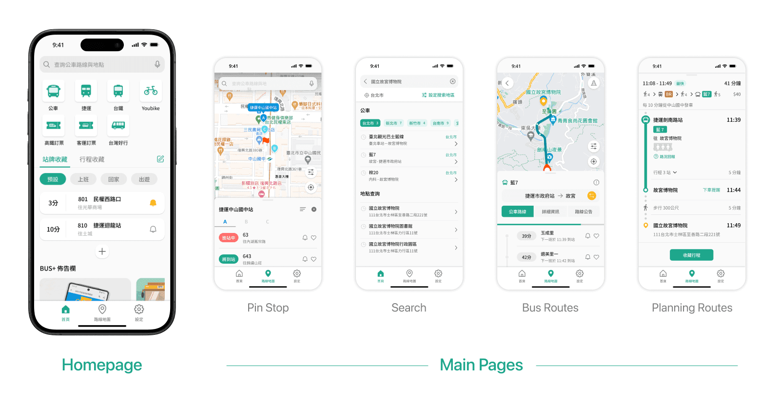
1. Homepage
2. Bus status page
3. Search bar and results
The Result
Result & Measurable Successes
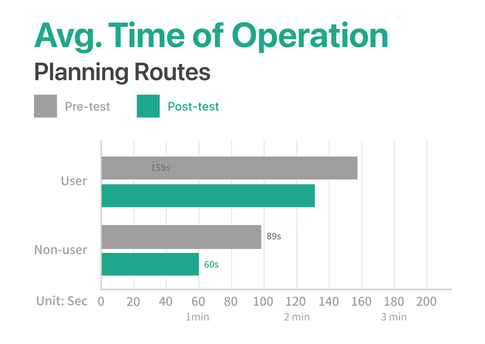
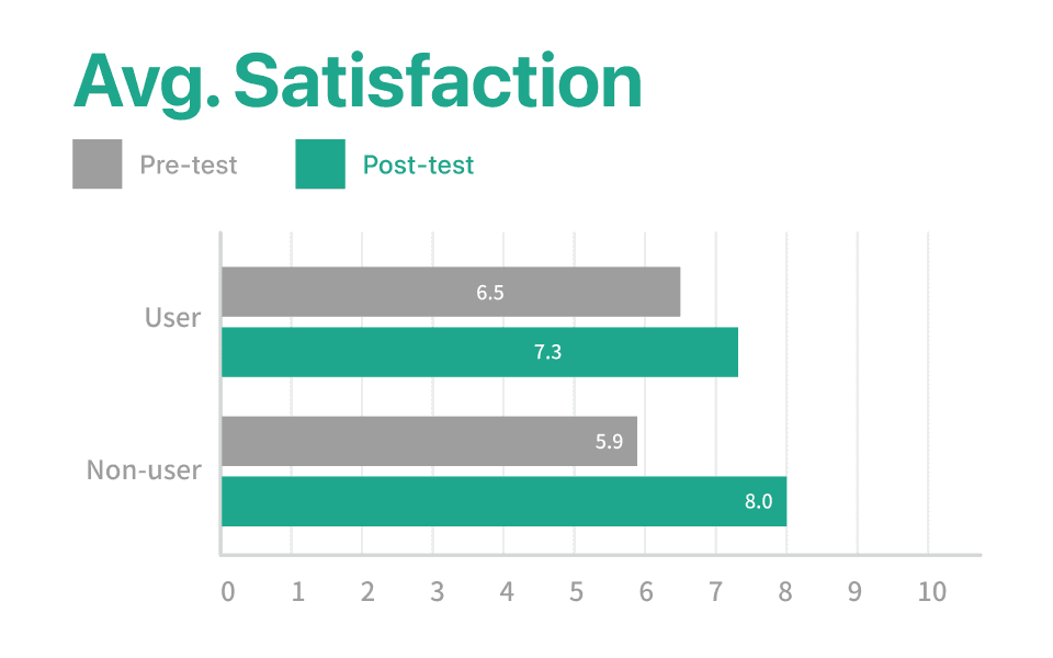
All three key metrics saw significant improvement.
Avg.Tome of Operation and Avg. Statisfaction were all improved significantly.
What's Next
Prioritize Changes and A Through Long-Term Roadmap
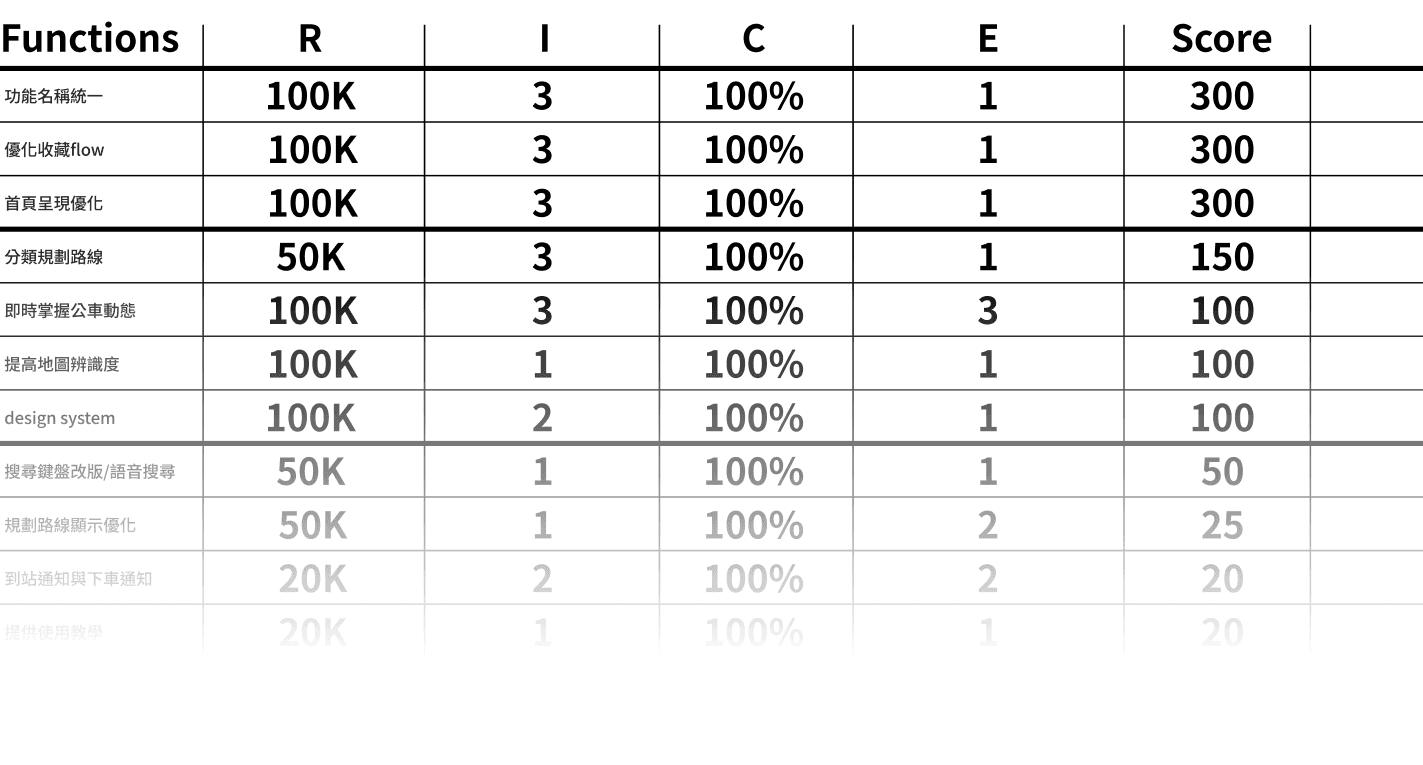
Even though so many ideas seemed valuable to the product, we selected those who would benefit in most transitionning situation. Then used the RICE metrix to prioritize which should be developed by sequence.
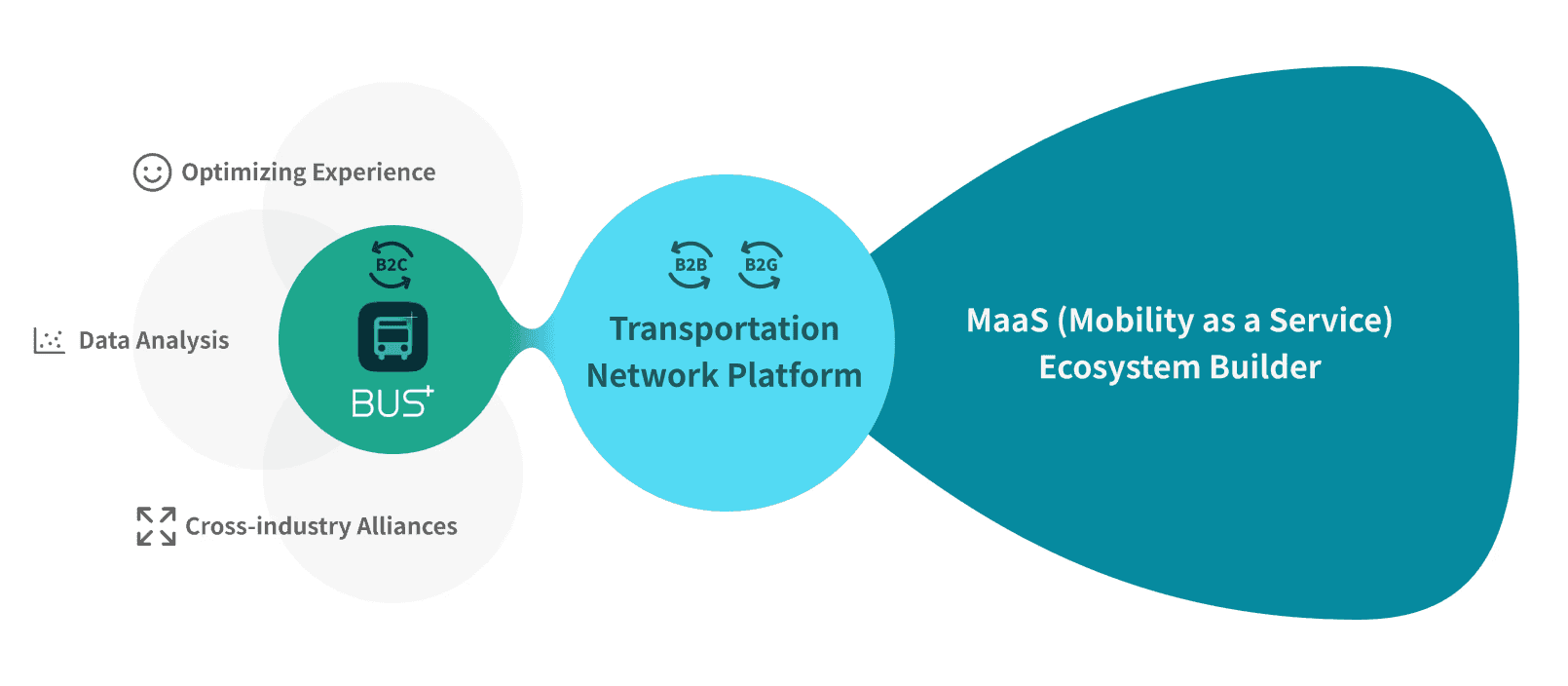
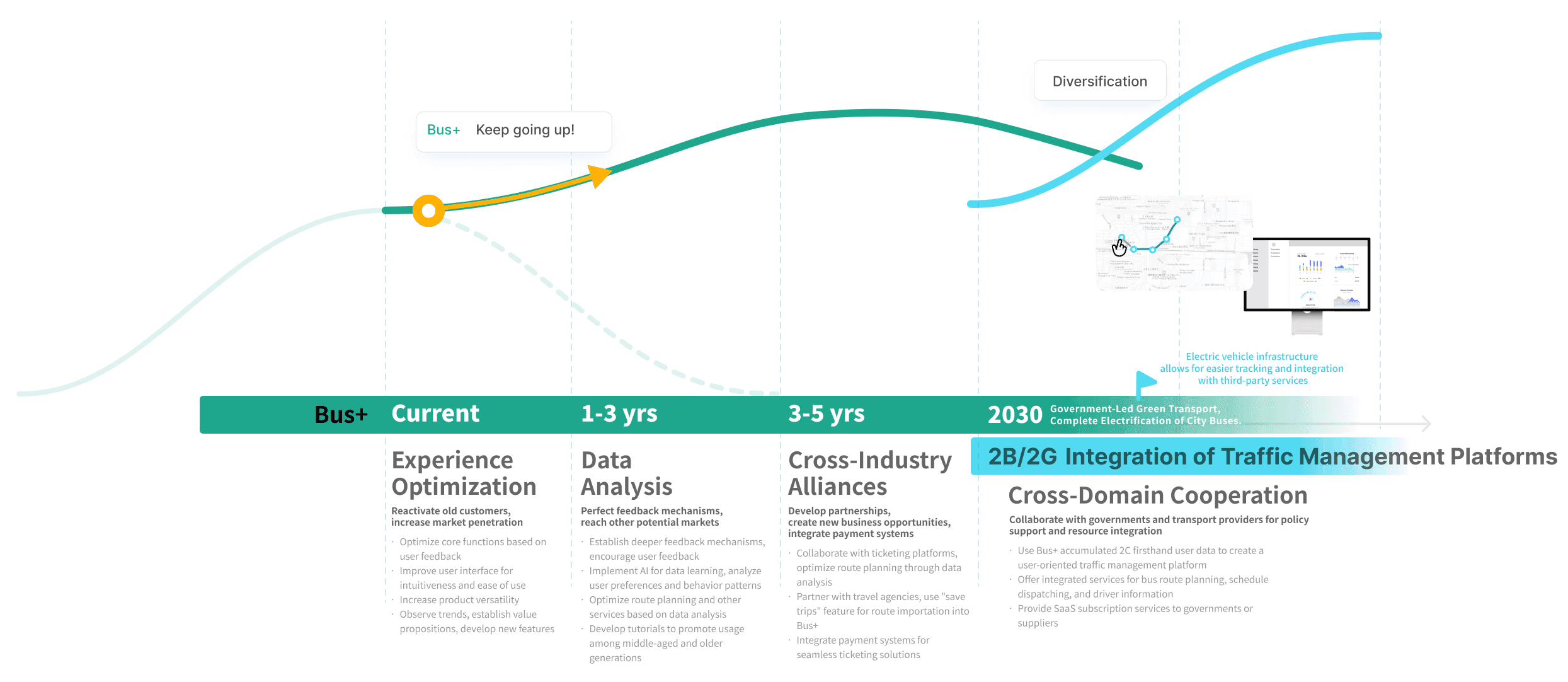
We proposed a long-term vision and a 10-year product roadmap to guide Bus+ toward sustained growth
Prioritizing with the RICE matrix.
10-year product roadmap.
Impact
Award-Winning, With Community and Industry Recognition
2nd place
Our solution earned us 2nd place in the competition among 20+groups.
150+ audiences
The results were live-streamed on YouTube, attracting over 150 viewers.
600+ claps
Our process and results became a popular article on Medium!
Retrospection
Innovation is great, but never forget user experience.
Initially, we aimed to introduce new features to Bus+ to make the project stand out design-wise. However, all user research indicated that it was not the right time for major changes. When faced with the dilemma of innovation, we chose to listen to our users.
Marketing Matters
In one of our surveys, we interviewed users of competing products to understand how they discovered the product. Surprisingly, most people started using it just because they had heard about it, without comparing it to other products. As a product designer, I realized that to maximize a product's impact, marketing strategy is crucial. It serves as the gateway to the product. Having a business mindset helps make our thinking more comprehensive and inclusive.