
Sep 2024 - Current
My Choice For All
Turned complex health info into an trustworthy platform.
Team
Design Lead (me)
Researcher
Junior Designer
Impact
75%
Comprehension Boost
AMIA Annual Symposium 2025
My Choice For All is a contraceptive resource specifically designed for the Transgender and Gender Non Conforming community. It grew out of a single pilot questionnaire.
I led design and research on a 3 people team, working directly with clinical and development partners, to turn it into a full healthcare website for the users making informed decisions about contraception.


Scroll to view more

The Problem
A Colour Palette That Lost Users’ Trust
The transgender users who tried the pilot questionnaire didn’t trust it.
The pilot tool was just a questionnaire, and the transgender users who tried it didn’t trust it. The palette read as too pastel, it boxed people into a strict gender binary, and it made the tool feel like it wasn’t built with them in mind.

Old tool's color palette read as too pastel, boxing people into a strict gender binary.
Approach
Cohesive Design System Through Actual Interview With The Community
Swapping the palette wouldn’t have solved it since colour was only one piece of a bigger visual system.
Changing colour in isolation would have left everything else inconsistent, so I suggested building a proper design system instead. I scoped the research into four atomic elements: images, colours, icons, and fonts. And since inclusivity was the whole point, we heard directly from the community rather than assume what inclusive meant on their behalf. So we ran HIPAA compliant interviews and usability tests with users.
Usability test to validatae.
User interview on visual elements.

Findings
What “Inclusive” Actually Meant Here
We tested images, colour, icons, and fonts directly with the community.
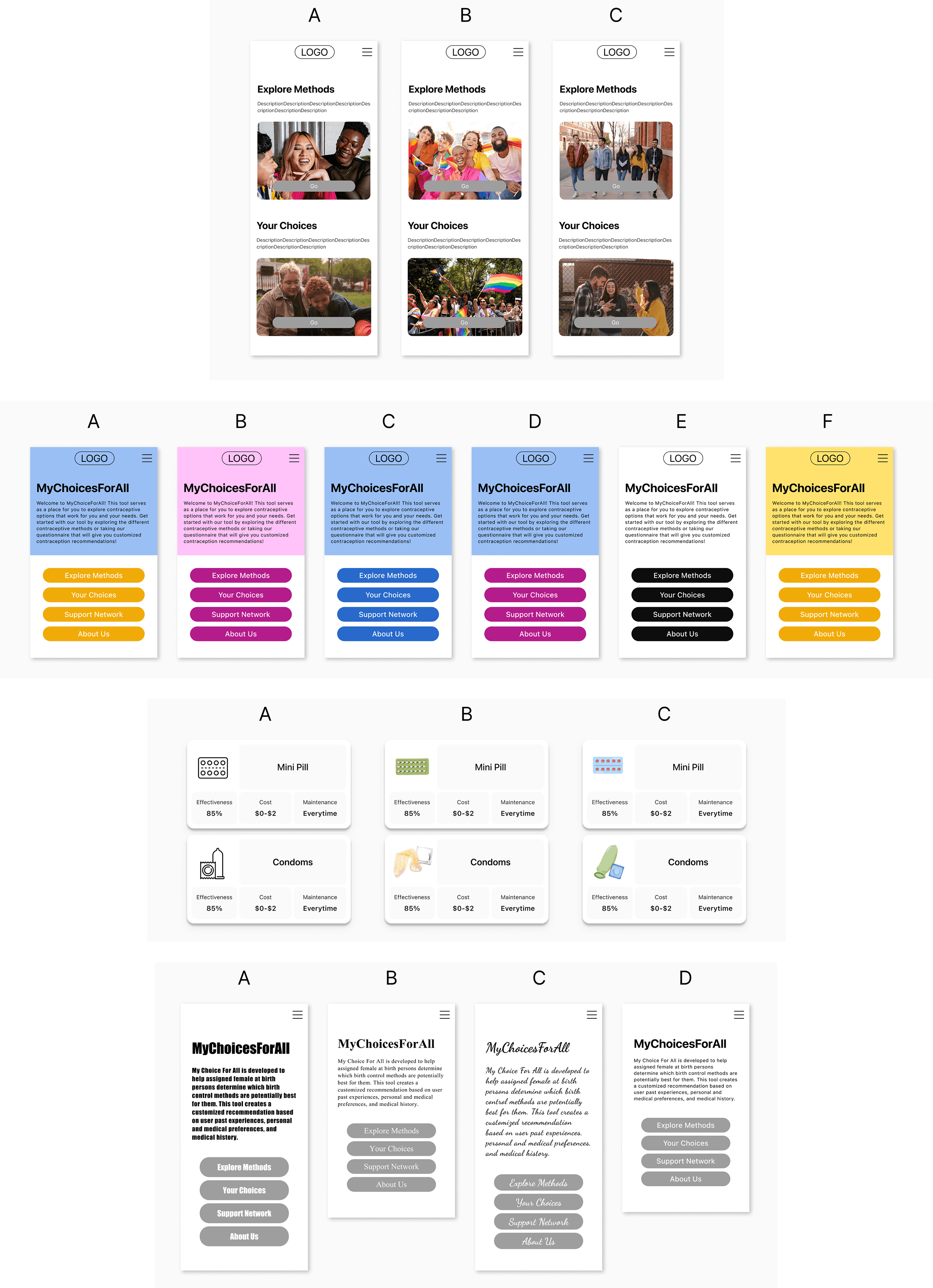
Rainbow imagery read as direct and welcoming, though some worried it looked like rainbow capitalism. Colour opinions varied, but everyone recognized LGBTQ flag colours instantly. Icons had to stay concrete, since anything too abstract lost real medical meaning, and readability mattered more than any symbolic font choice.

The Turning Point
Being Seen Isn’t Always Safe
Not everyone using this site has come out yet, so being visibly queer isn’t always safe for the person on the other end of the screen.
I tested three directions: a black-and-white neutral look, a transgender-flag colour look, and an authority-driven blue look. But then realizing this pushed the design toward something that felt inclusive to the people who needed it, without outing anyone who landed on the page.
The first 3 visual directions.


Final Design
Recognizable, Without Putting Anyone at Risk
The final direction balanced a primary blue with a flag colour cue, swapped illustration for authentic photography, and kept readability and method icons sharp.
I documented the whole visual language into a design system so the team could keep building on it.
Final pages.

Design system.

Other pages: Method Profile, Explore Methods, Compare Methods.
Impact
75%
improvement in how well users understood their contraceptive options
Co-authored paper — poster presentation at AMIA Annual Symposium 2025
Retrospection
Being A Design Lead and Cooperating with Medical Professionals
The hardest part was not just the design. Internally, the cross-team communicaiton were sometimes misaligned. Acting as the bridge to translate clinical needs into technical constraints was my biggest takeaway. I learned how to use rapid prototypes to streamline communication, reduce iteration misalignments, and ultimately get everyone on the exact same page
Balance Pace Between Academic Research and Digital Development
Building a website while writing an academic paper was a unique challenge. This project spans more than 3 years, and most of the timeline is dedicated to writing, analysis, and research. As a result, development moves very slowly. I struggled with the slow pace at first, but eventually I learned to adjust and adopt the mindset of a researcher.